User Experience + First Moment of Truth

User Experience + First Moment of Truth
Capture the user at the first interaction.
I started working with Organimi a little over a year ago and I worked on BringList V-1.0 Muhammad Ali a little over a month ago. While working on both these products, I started picking up design related books and blogs to learn more about the area. Soon after I realized that both needed strong user experience and product design.
To me this means a couple of things:
Feature/Benefit — otherwise known as product messaging is clear and succinct.
The copy in product supports intended action/reaction — the save button say’s ‘save document’ clearly through text or visuals.
Functionality is clear — I can navigate around the product without fumbling around. We need to put the user in a state of flow.
At critical steps communicate with user through a feedback loop.
When a user downloads or signs up for an app and opens it for the first time — the value must be delivered. This applies to both, B2B and consumer apps (Web/Mobile/Desktop). That is the moment where you must charm, convince and intrigue the person enough to continue onwards into the journey. No one likes a steep learning curve and we don’t have time to figure out how stuff works. Our attentions are divided enough as it is.
BringList is an unconventional app because it generates a grocery list or to-do list from a text message. My assumption here was that we had to communicate the potential value clearly at first use or we would get alot of uninstalls.
In other words I have to grab the user at the First Moment of Truth or FMOT ( A jargon I used and heard during my time at P&G). If this was not achieved in BringList they would delete the app without a second thought.
So what does it mean to catch them at the First Moment of Truth? Take a look at Dropbox. When you first open the Dropbox app, there is a splash screen that communicates what Dropbox does and why you should care.
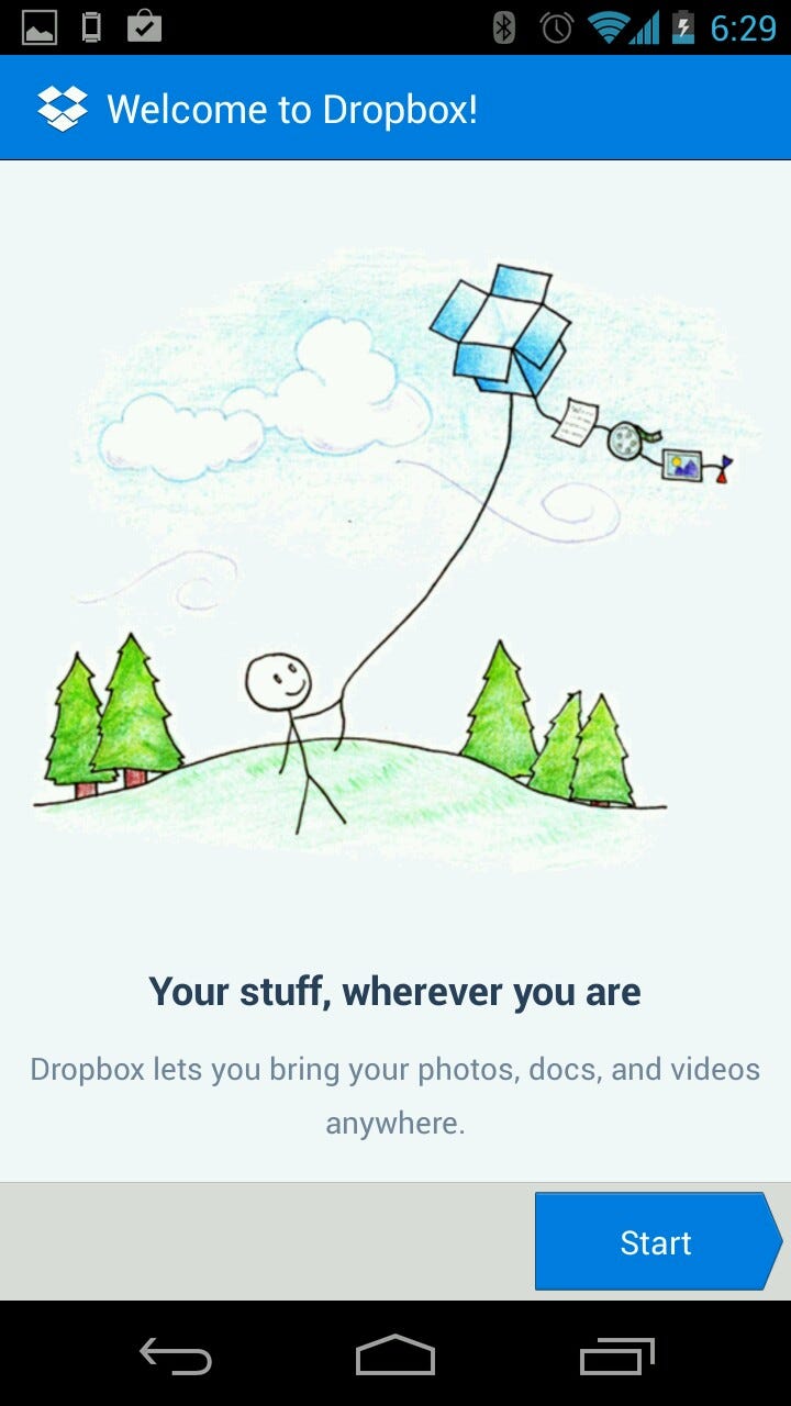
It’s simple but effective. If I was in a comma for the last couple of years (Aware of the internet and the concept of USB storage but missed the Cloud Storage Revolution) I would probably grasp the concept of Dropbox pretty quickly.
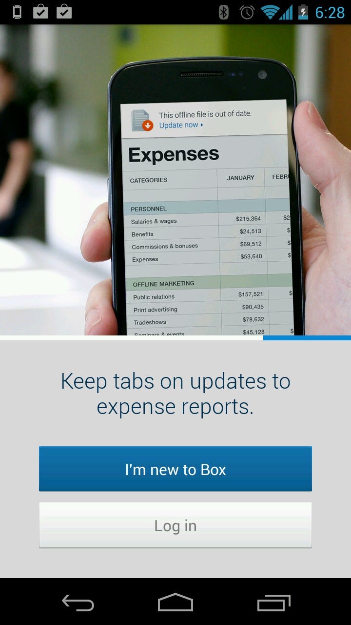
Box is another example — the enterprise focus comes through.
I used Dropbox and Box because that came to mind. There must be others who do the same — Bump is another example. They have a small animation of bumping fists and files jumping between the two devices.
As for BringList — my assumption was correct. After we launched our first version I noticed some uninstalls happening through the Google Play Developer Dashboard. It was not a big jump to assume that some of the uninstalls occurred because there is no splash screen + the messaging I have on Google Play is well, all over the place. When the person opens the app for the first time and are taken to a blank screen (Because there are no items listed out) it just causes confusion and perhaps anger. The result the app goes to the trash.
The design of the product should communicate value + guide my actions towards the intended purpose.

Above is the first splash screen I made.It is not well designed (both visual and content) so I’ll be re-doing the whole screen again.
As for Organimi it was more challenging to create a FMOT.
An enterprise web app focused on HR folks, I did tutorial videos, I wrote a FAQ, short help guide, a long help guide and the basic help guide to help guide the user journey. But the core issue was that when users sign in, they are taken to a blank canvas. This can be very intimidating and a potential roadblock for further use.
So we set-up a template Org Chart for them with blank roles. That did not quiet solve the problem so the next step is to set-up a sample Org Chart with dummy data for user’s to explore the functionality. For now I do this by providing them sample dummy data and encouraging them to upload and create an Org Chart following a step by step guide. Why? Because it will take a user a couple of minutes to set-up his/her Organization Chart in Organimi and then derive value from it’s simplicity and easy of use. We need to accelerate that ‘Aha’ moment and give them a sense of what it can do for them the first time they sign in to the application.
Product, User Experience and User Interface Design should facilitate the user’s intentions and actions towards the desired outcomes. This can range from a guided tour, a splash screen or a complex demo.
Thanks to my friends and family for reading drafts of this post.